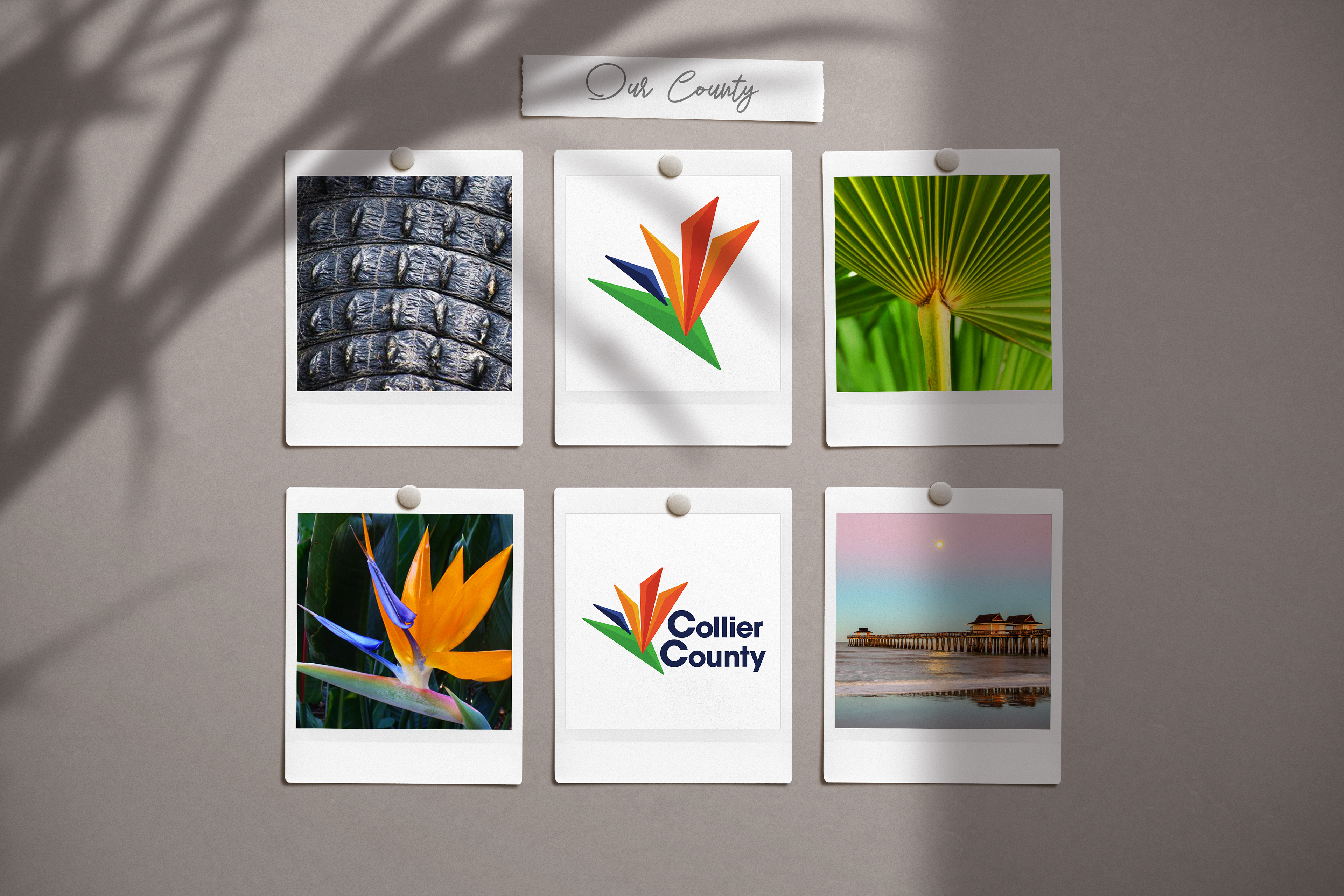
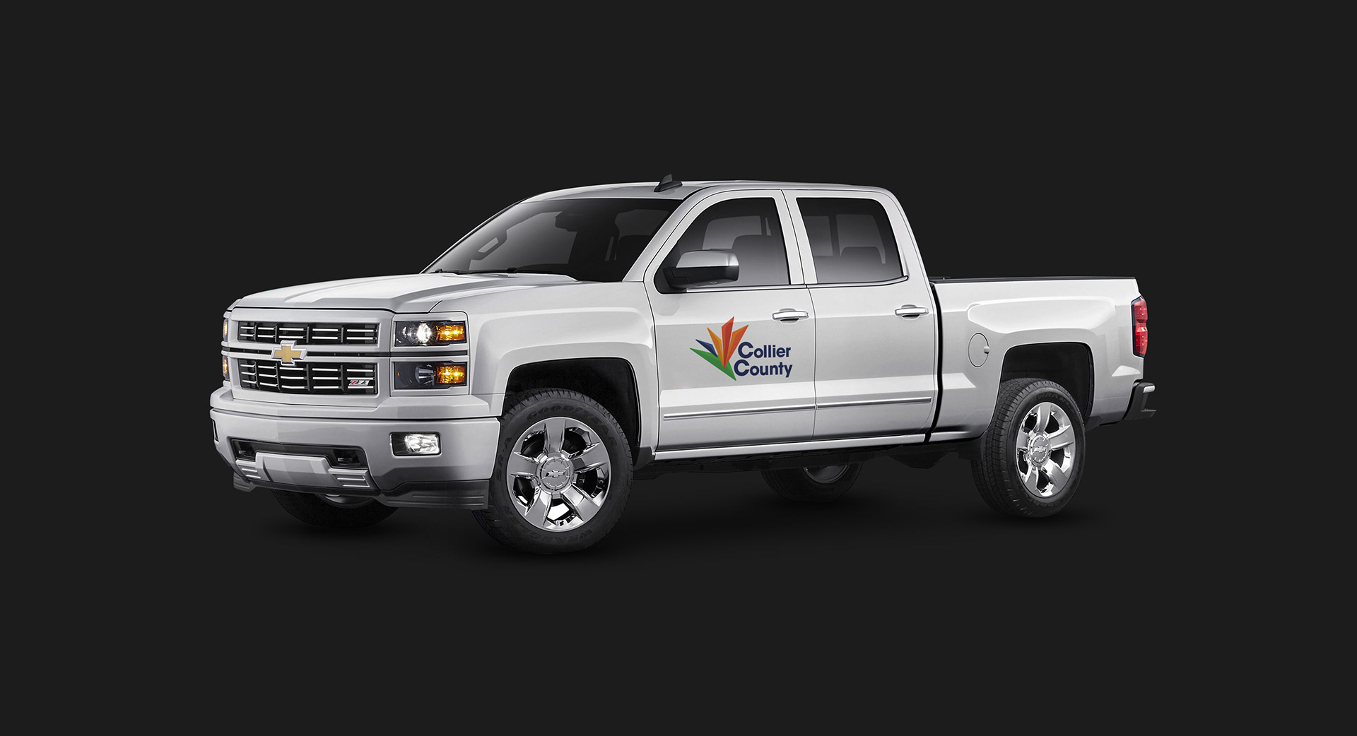
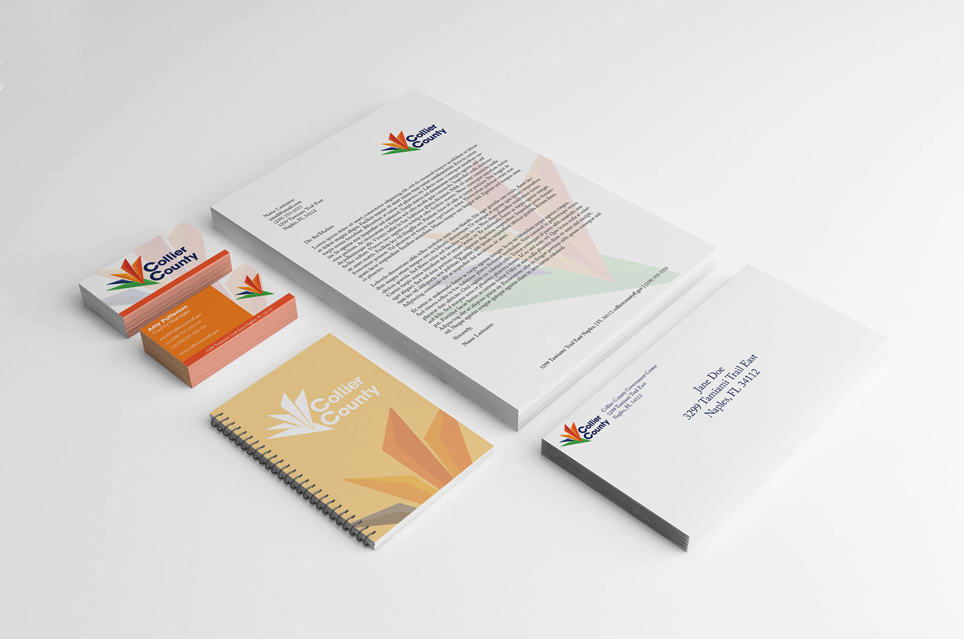
Logo Redesign Project
Objectives:
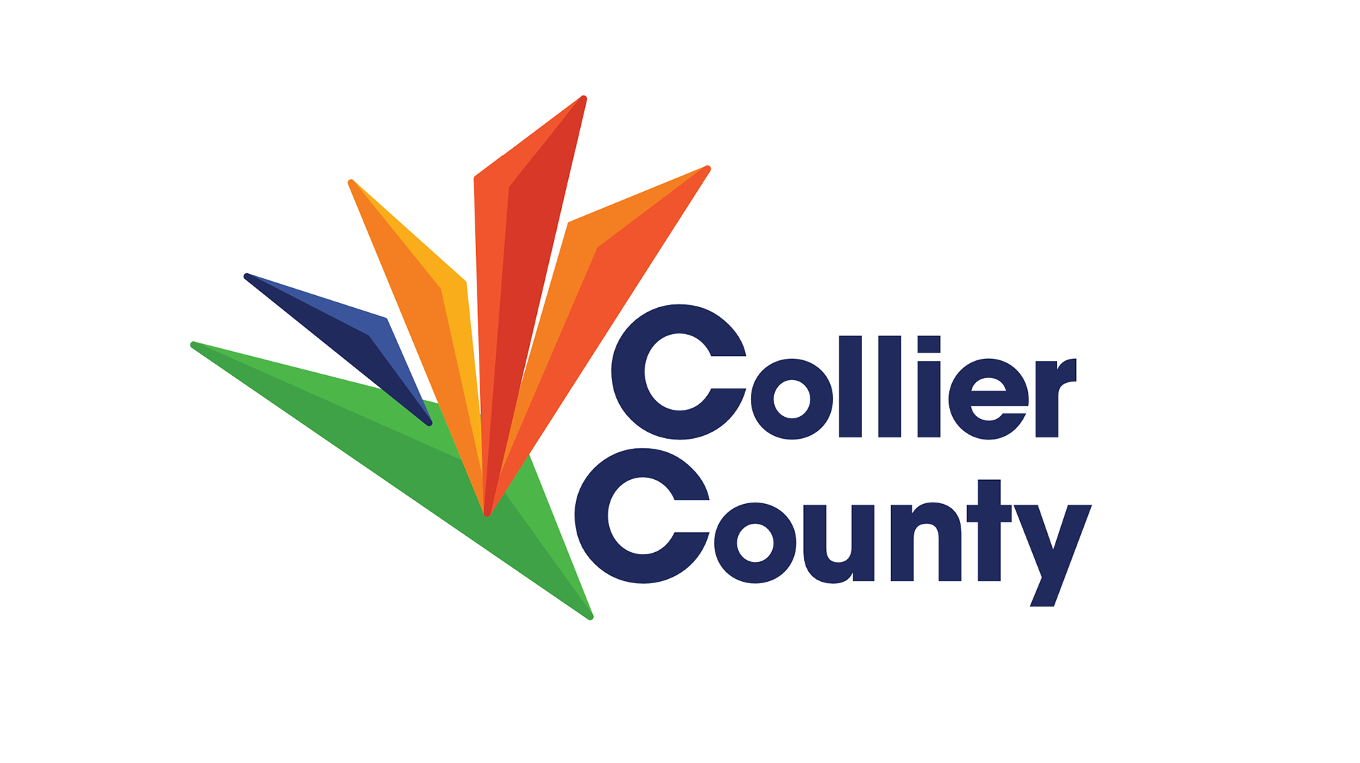
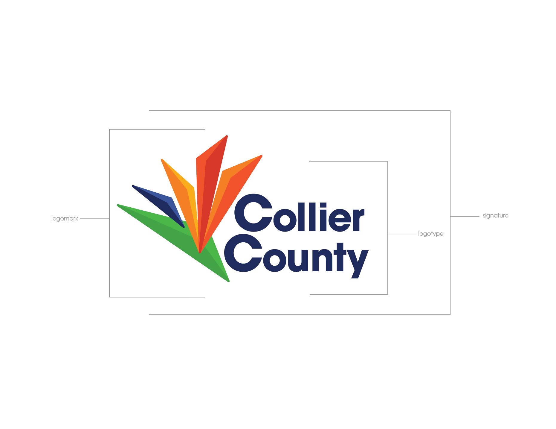
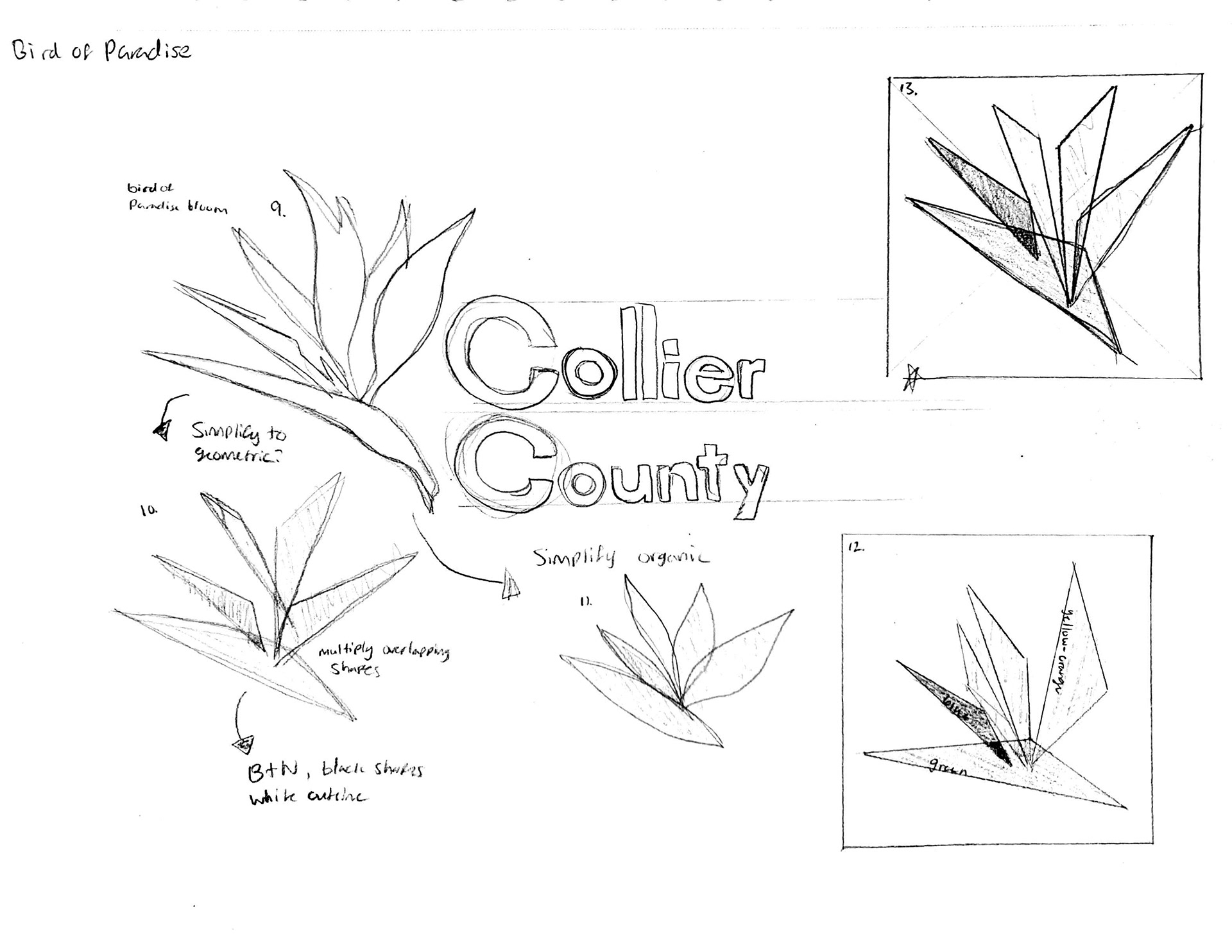
This personal project was an exercise in taking an existing logo and giving it a fresh look. The Bird of Paradise icon represents the natural beauty unique to the county.
As a part of research for this project, 28 individuals (20 residents, 8 non-residents) were asked to complete a written survey. Participants were given a set of words (some positive, some negative) and were asked to circle what they felt best represented the county: clean, welcoming, big, cheap, problematic, inaccessible, organized, expensive, diverse, growing, crowded, affordable, exclusive, beautiful, small, popular, historic, prepared, safe, unique, disorganized, failing, coastal, and healthy. 39% of the participants surveyed chose the word, beautiful.